McLendon Website
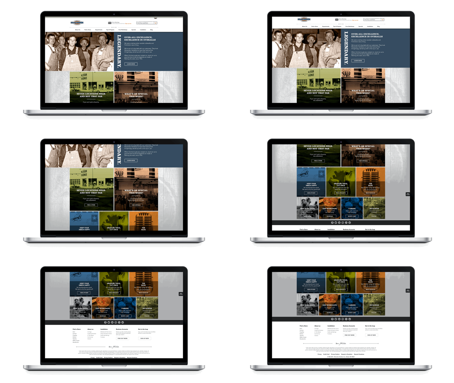
McLendon Hardware was lacking in their online presence and was in need of a responsive retail site. My team created a fresh aesthetic and voice to introduce new customers to the unique hardware store while retaining the existing customers. This project was a fast turnaround, within 4 months we had a rebranded site up and running for the hardware store. The full site experience was launched in 3 phases.
Role: Designer
Responsibilities: Web design | UI/UX | Production | Wire-framing | CSS/HTML Coding
Goals: Create and execute a new look and feel for the hardware brand. Launch a responsive e-commerce site that reflects the new company branding.
PHASE 1
Rebranded, informative and content heavy pages. The emphasis for this phase was to create a site where customers could easily get information on the 7 locations. We also wanted to provide customers with rich content to help educate the DIY’er.
PHASE 2
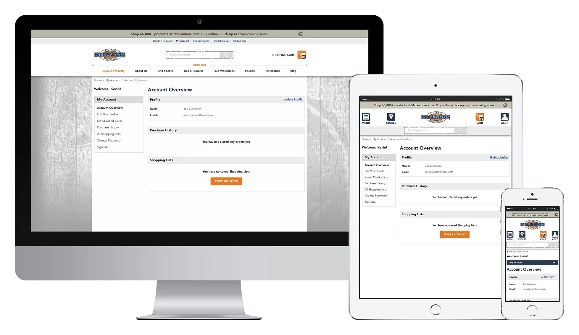
A more e-commerce based site, allowing customers to browse over 80,000 products that are available at all 7 stores. The products also allowed customers to see the inventory available at the store locations. Customers were also given the ability to create accounts and shopping lists to make the in-store shopping experience easier and more enjoyable.
PHASE 3
The final phase of the site, which was launched in late 2017, was the buy online pick up in store function. This allowed customers to purchase items online and within 2 hours the order would be ready for the customer to pick up at their local McLendon Hardware Store.


